
Why does font matter? How does the choice of font affect the way people read text or what impression they get of a website or a film? Who creates fonts, and how, and why? Simon Garfield explores all this and more in his new book, Just My Type.
You might think that this sounds dull. In fact, this book about fonts is highly entertaining. It gives short histories (‘font breaks’, as Garfield phrases it) about various fonts and the people who shaped them, while also exploring the history of print and the importance of fonts in general. Garfield manages to impart information while also giving juicy titbits of information about the often eccentric people and/or circumstances involved in the development of new fonts.
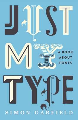
by Simon Garfield
352 pp, Profile
The author ranges all over the field in this book. Garfield discusses why legibility/accessibility/readability are such essential concepts in the field of fonts, how they have been understood in different ways over time, and how some appear more honest than others (such as Gotham). And he explores why particular fonts have become successful and now appear all over the place (such as Helvetica, which he says is everywhere in urban settings). He then moves easily into giving background about some of the people behind the fonts, such as Margaret Calvert, who developed many road signs, or sixteenth-
Garfield also explores the influence of font on particular types of text. For example, he talks about the fonts used in comics and how the typographer of Batman: The Dark Knight Returns ‘achieved that near-
In short, this book is packed full of detail about a topic that should fascinate just about anyone. After all, whenever we read, we are being subconsciously influenced by the font in which the text appears, and we get ideas about the author, the content, and the context from it. This review is in Kepler. What do you think that’s doing to you as you read it? For one thing, I hope it encourages you to go out and get Garfield’s book.