Maps and the City: Richard Porch describes his love of maps and offers a unique hobby to those intrigued by history and architecture.
I have always been fascinated by maps of towns or cities. Although notionally nothing more than a scaled diagram of what this or that place was supposed to be comprised of and where everything was located, they were (and are) unavoidably so much more than that. Of course, no one uses maps anymore for the mundane purpose of locating an address. The age of the A-Z fold-out plan with the index of streets printed on its reverse which folded down like an exercise in origami to something that you could theoretically carry around comfortably in your coat pocket is long gone. Instead we now have Google Earth which enables you to explore your destination and its local environment digitally before you go anywhere near it. And doubtless there are sundry other ‘apps’ (of which I know extraordinarily little) that you can download to your Smartphone (something else I know nothing about) the better to direct your efforts at reaching it.
What maps (as opposed to apps) are good at is capturing history. Maps of a town or city enable you to see its historic evolution a bit like a core sample drilled through polar ice which displays its history somewhat like tree rings. Only infinitely more accessible. A great many places started out as a Roman marching camp or a village that accreted other villages to it as it grew and merged. Paths in and out evolved into tracks which in turn mutated into roads, turnpikes and then into bypasses and motorways, etc. Maps would be generated at first primarily to show who owned what and where. The legal necessity behind defining fields, property and access rights would operate to generate maps until this or that place became big enough to need a proper map showing the layout of streets and key buildings.
However, it is buildings and by that I mean all buildings, however mean or utilitarian that define a city. They show up on maps and plans almost inevitably rendered as rectangles of one kind or another, defined by the road or avenue that places them in urban space. This is of course our commonest impression of a map and one we were destined to live with forever until the onset of the digital age. A major innovation in map design was instigated by Giambattista Nolli (1706-1756), the Italian architect and surveyor who invented the ‘ichnographic view’, which was a horizontal section of a building showing true dimensions according to a given scale. In a Nolli plan the outer walls of a building, doorways, windows and the correct thickness of walls, the positions of any piers, columns or pilasters and courtyards were all shown to scale too. This approach manifested itself most notably in his Pianta Grande di Roma which took him 12 years to prepare. This magnificent feat of surveying was composed of 12 copper plate engravings each 176 centimetres (5’9”) by 208 (6’10”) centimetres. His client for this ambitious project was Pope Benedict XIV who wanted a map of Rome that would, for the first time, show the demarcation of the city’s 14 rioni or districts. Nolli’s plan must have looked vastly different from all others because he filled in the shape of all buildings and columns in deep black. The roads and lanes were left white. This was not the norm and in addition, maps at that time were orientated so that east was at the top, where north is on all maps now. Nolli used magnetic north as he used the compass to underpin the city’s topography. The result rendered the city more legible than it had ever been and had been so accurately surveyed that Nolli’s plan was still in use until the 1970s.
A similar scheme to this was Baron Haussmann’s (1809 – 1891) plan for Louis- Napoléon (1808 – 1873) for the redesign of Paris 1853 – 1870. Haussmann was a public official not an architect nor that even more exotic species, an urban designer. Before commencing on the demolition of 19,300 historic buildings and the construction of 30,000 new ones (to say nothing of train stations, reservoirs, parks, etc.) and the all-defining boulevards, a map was needed. In 1853 Haussmann in turn got his architect-surveyor Eugène Deschamps to produce the first ever comprehensive map of Paris and to a scale of 1:5000. It took Deschamps three years to produce a fully triangulated plan which measured 15 square metres (160 sq. ft.) and was mounted on a screen behind Haussmann’s desk. The latter was so in thrall to it that he once declared, “Many an hour have I spent in fruitful meditation before this altar”. Using this map as his starting point Haussmann ‘ironed-out’ what he saw as the city’s many imperfections. These were any awkward physical bump, dip or perceived obstruction and much slum clearance of old medieval streets. The prime beneficiary would ultimately be the view down any boulevard that would be untainted by squalid architecture and higgledy-piggledy urban layouts. Like architecturally scaled plastic surgery the resultant operation would eliminate all the wrinkles and blemishes and present a new face to the world. And this it did.
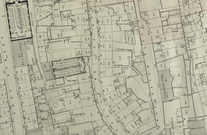
Not all maps have to be enormous undertakings. One of my favourite maps of a city (or town as it was then) is the 1852 Board of Health plan of Swansea. The board (formed in 1850) commissioned Samuel Gant, a surveyor from London, to map the town in order to help regulate sanitation in what was a burgeoning maritime-industrial seaport which traded on a global basis and was one of the crucibles of the Industrial Revolution in 19th century Britain. The outcome was a magnificent cartographic ‘snapshot’ of a mid-Victorian town with not just all its architecture large and small but also its privies, stables, vent pipes and outhouses, etc. It took Gant two years to complete it and the result made the investment worthwhile. Gant’s effort was not a Nolli plan because he did not fill in all the buildings in black, instead he filled them with a pink wash and left everything else as linework. For the larger public buildings he did what Nolli did and showed ground floor seating plans, gardens (and their layouts are shown) and all the slum courts with their one up – one down arrangements often with unregulated industrial concerns operating cheek by jowl with them. As a map it offered as much information as any aerial photograph might have.
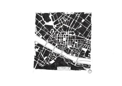
My favourite way of enjoying city maps now though is to strip them of all their information graphics, street names and tourist information and reduce them to being graphic marks. As a purely creative exercise I did this with plans of central Florence, Bruges, Barcelona and Naples. The effect is as diverting as it is instructional and for anyone with even half an eye for historic layouts one can often still make out how this or that city evolved via the evolutionary enlargement of i.e. its city walls. They still tend to show up like the whorls and creases on a fingerprint. I think it possible to identify a city by its planform even when it is devoid of street names.
I made a drawing of central Florence based on material I brought back with me after a visit, the focus was the Piazza del la Repubblica a short distance away from the River Arno. In that part of Florence the roads all seem to flow towards the Arno as if under some sort of magnetic compulsion. Even the strong diagonal impact of the Stazione di Santa Maria Novella (railway station) conforms to the geometry of the attraction on the map. The diagonal field is distorted by the core of the Piazza del la Repubblica which is oddly orthogonal and as a consequence all the buildings for 3-4 blocks on either side conform to that geometry, rather than that of all the other roads that arrive at it from virtually all over the compass.
The heart of Florence can be traced back to Roman times and the siting of the two principal roads that all towns, cities and military camps built by them were designed around. These were a main north-south road or ‘Cardo’ and the main west-east road or Decumanus – Maximus. In Florence the former can be found at Via Calimara – Via Roma and the latter at Via Strozzi / Via del Corso. All of which either intersect with the Piazza del la Repubblica or straddle it. Where the current Piazza is located is where the original Roman Forum or central marketplace where food and goods were traded. The Romans tended to dot their main towns and cities with ‘themed piazzas’ which provided space in which to resolve matters relating to a spectrum of activities ranging from commerce to governance. By the medieval period this whole area had become a warren of squalid alleys before being cleared in the period of the Risanimento (trans: making things healthy again) during the period when Florence (as Paris did under Haussmann) demolished large areas of what were deemed insanitary eyesores, Florence was actually the capital of Italy in the period 1865 – 71, hence projects of this kind. The present appearance of the Piazza is due to this slum clearance project. Nevertheless, I can readily make out the location of the first four sets of city walls by looking at any modern plan or even better, a map regression sequence of plans from say 1700 onwards.
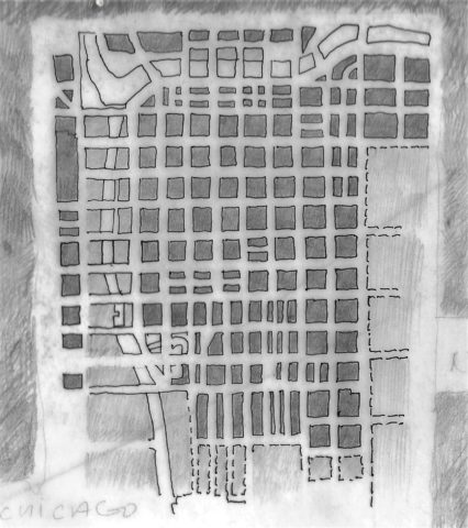
You can also stumble across fascinating simulacra when you start to monkey around with plans. For example, when you reduce a plan to being just a graphic mark by editing out all the usual informational distractions, you inevitably change its function and aesthetic. This sounds like a painfully obvious statement to make, but it can cause interesting things to occur, that otherwise would not. I discovered this when comparing a Maple leaf with a Nolli map of the Indian city of Ahmedabad, as one does. The biologically produced veining of the leaf corresponded graphically with the lanes generated by the social process involved in a living settlement growing and expanding. The leaf pattern occurred to me whilst wandering around a garden centre and seeing the pattern of veining on a leaf. This, in turn, turned my mind to thinking about the street layouts on maps I had seen of Isfahan (Iran), Cairo and New Delhi. Interestingly, in looking at city plans throughout the developed world, few others (certainly none in grid-iron planned America) could be said to even remotely correspond. Perhaps in the Arab world – especially in the older parts of the big cities – there is obviously unplanned organic growth involved whereby the densities are so high that pedestrian streets shrink to become merely lanes that wander as the architecture consumes free space. I am not for one moment suggesting that there is a connection between a Nolli plan of Ahmedabad and the structure of a Maple leaf, merely an ever so slightly unnerving similarity of layout.
All of this started by looking at the map of a city. Try making a map regression sequence of where you live; even in an average suburban environment you will see dramatic changes over a 100-year period. The Ordnance Survey mapped everywhere in Britain at 10-yearly intervals from 1841 onwards. Such a sequence very visually shows the ebb and flow of history (development) in your street or road without you having to go anywhere near a history book or a bloody computer.